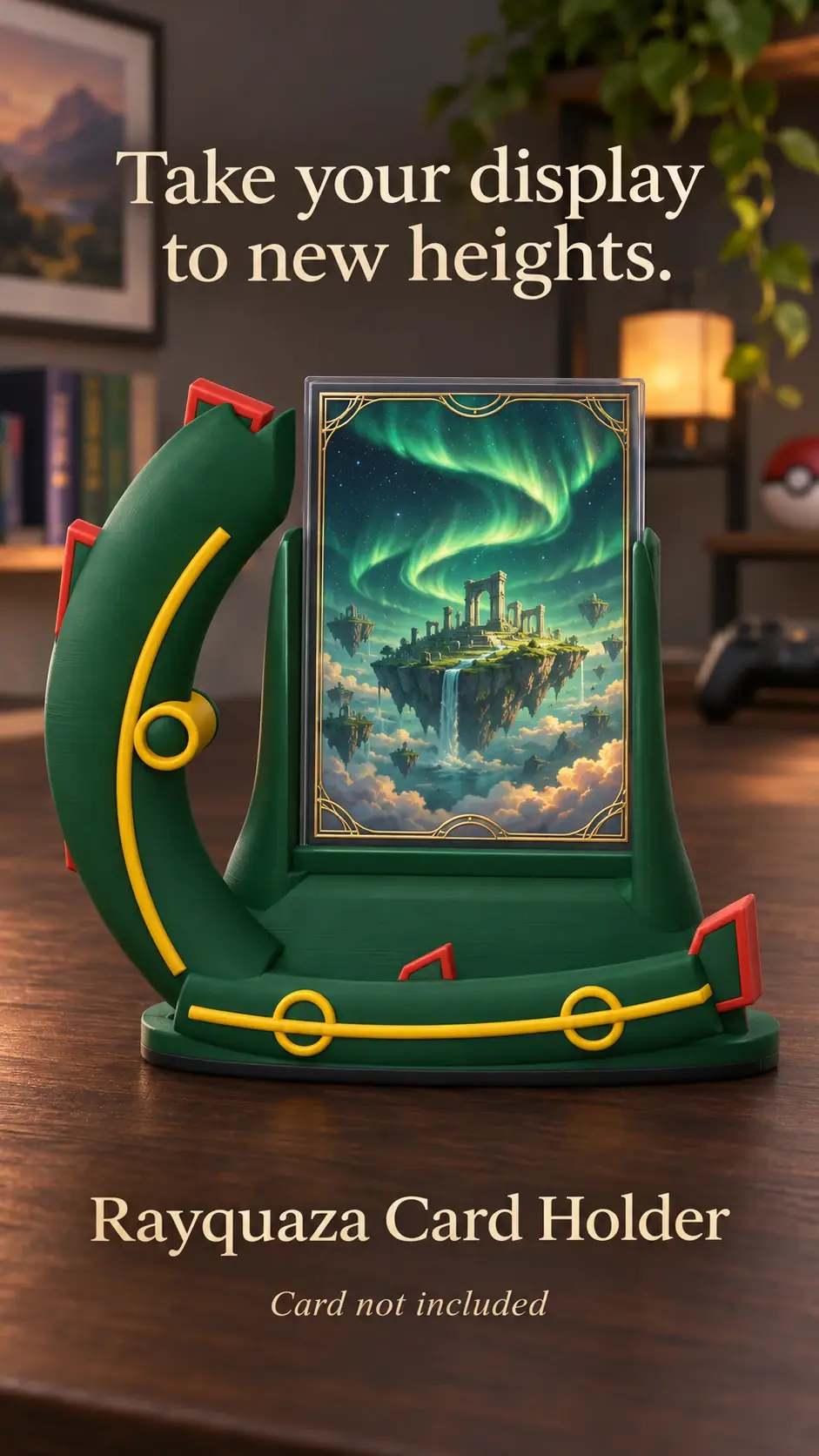
A background is the visual space around the card and holder. It can make the display feel connected to a room, or it can compete with the artwork. Start simple and add detail only if the card remains easy to see.
Use contrast to separate the holder
A light holder often reads clearly against a mid-tone or darker background; a dark holder may need a lighter shelf or wall behind it. The goal is for the holder outline to remain visible.
Look at both the card artwork and the holder when choosing a backdrop. If the colours blend together, try a plain surface in a different tone.
Keep texture and pattern subtle
Wood grain, fabric and simple shelves can add warmth without taking attention away from the card. Large patterns, text and many small objects can make the area feel busy.
Use one background element at a time. If you add a frame, plant or figure nearby, make sure it does not cover the card or make the holder harder to see.
Check the whole arrangement from a distance
Step back to your normal viewing distance and see whether the card is still the first thing you notice. Adjust the background, not the card, if the arrangement feels crowded.
For photos, a temporary plain board or uncluttered wall can provide a clean backdrop without changing the permanent room setup.
Product previews and sample card artwork are for illustration. Check each listing for the holder’s options and dimensions, and confirm card or protector fit before ordering. The designs are independent and fan-inspired; Custom Card Display is not affiliated with or endorsed by Pokémon, One Piece or their rights holders.
READY TO LOOK AROUND?
Find a display for your collection.
Browse the designs and check dimensions and options on each listing.