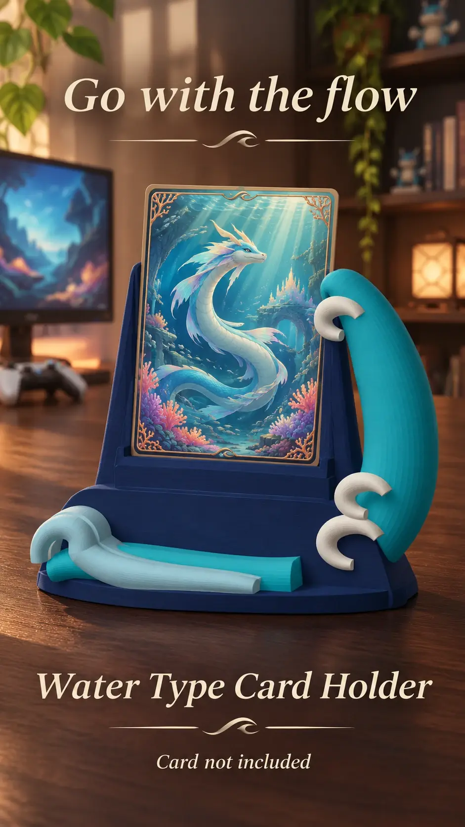
Colour can create a strong visual rhythm, but lighting and screen previews may shift how shades appear. Base the arrangement on the cards themselves.
Choose one colour feature
Use the dominant artwork colour, border colour or a single accent consistently. Do not switch rules midway through the display.
Group with spacing
Arrange similar colours together and use a small gap between groups. A neutral background can help distinguish adjacent shades.
Review under room light
Check the arrangement in the lighting where it will be seen. Screen colours may not match the printed card exactly.
Product previews and sample card artwork are for illustration. Check each listing for the holder’s options and dimensions, and confirm card or protector fit before ordering. The designs are independent and fan-inspired; Custom Card Display is not affiliated with or endorsed by Pokémon, One Piece or their rights holders.
READY TO LOOK AROUND?
Find a display for your collection.
Browse the designs and check dimensions and options on each listing.